The following few posts will recap my experience with the newly released Microsoft Windows 8 Developer's Preview, made available as a free download from Microsoft themselves.
After that we need to build the customary Installation media from the download. A simple matter as its an ISO image, a CD/DVD image file which contains all the information needed to burn an installation disc using any number of tools available. I used ISOburner a free safe tool for just such tasks. Once the DVD is done its on to installation. I decided to do this as an actual install rather than a virtual one just So I could get the full experience. So I went into my Hard drive drawer and picked an empty one I knew was operational. 80GB of space should suffice I thought, I don't think I'll be installing many things onto this, and I it will be basically for testing purposes.
So the Install goes similarly to Windows 7 installation, it lets you pick your destination drive, and ipartition it as you see fit. The installation automatically creates a 300MB system reserved partition regardless of your partitioning choices. It deducts the space from your main OS partition. Once complete it proceeds to copy and install files. It took quite a while to install, about 30 minutes in my not so powerful test PC.
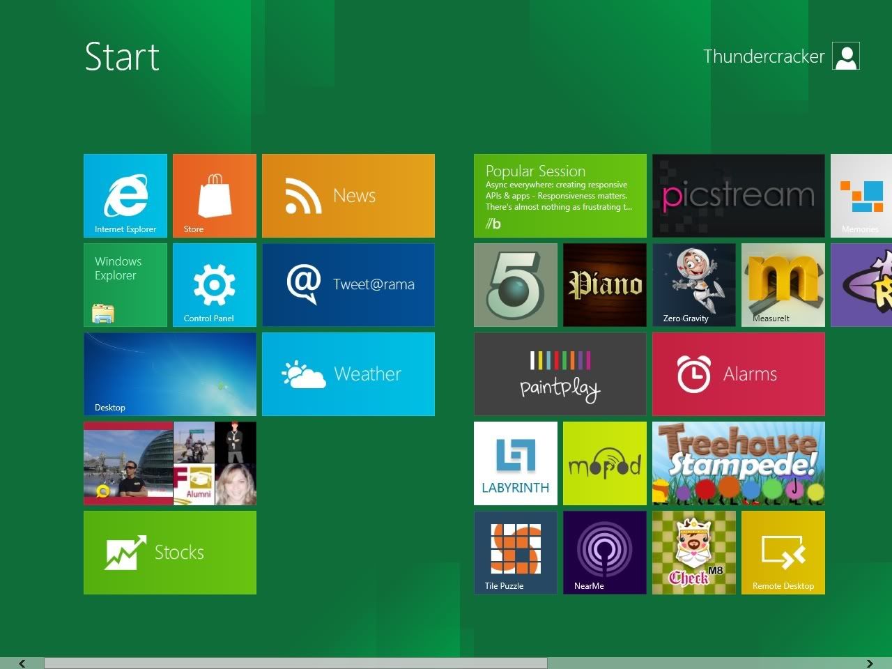 When all is said and done, you are treated to the new Metro Start Screen. Instead of your regular start menu, you get a full screen of what Microsoft now calls tiles. Squares or rectangles that serve as shortcuts for applications and other functions. Several pre-installed apps and games grace the screen, most notably Socialite the Facebook app, and of course IE10 Metro version. (more on this later)
My first task of course was setting up the Internet connection, as Windows did not automatically detect/install my wireless card. Of course you can't really tell what is going on as the interface is aimed at final users, so off the bat we need to dig into the new layout to find the familiar Device Manager. (I wonder If I can add a Device Manager Tile for easy access). Installation of the wireless card was as painless as it has been in previous versions of Windows.
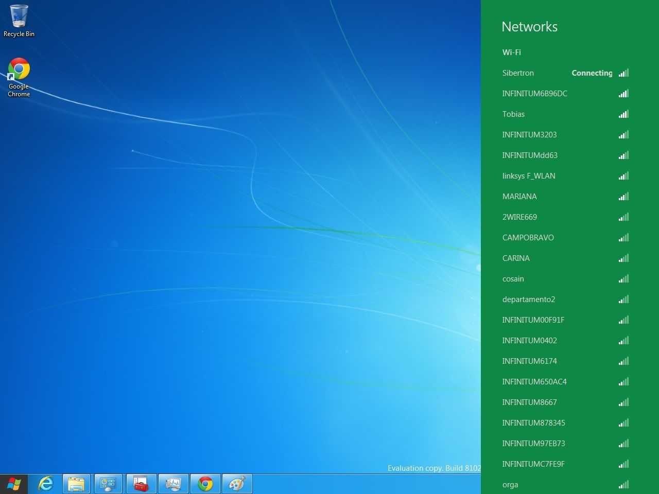
With that done we get a look at the new Wireless network list; a green sidebar, as Microsoft calls it. It offers a very nice, large and crisp font for the network names and the standard bar display for the signal strength. A nice face-lift to what we had been seeing since Vista.
 The next test drive was of course IE10. Now here's were things get interesting, Microsoft has divided the applications into 2 categories: Desktop applications and Metro Style applications. Desktop Applications are your run of the mill apps you've been using in other versions of Windows, they open in standard windows, and can be maximized, dragged around, closed etc... The Metro Style App is the new kind of app that takes advantage of the new Metro Engine and runs full screen, cannot be dragged or moved, or even closed in the regular sense of the word. Its basically a full screen dynamic Web application that runs outside a browser and covers the screen. It can be swiped out of the way, or hidden. When hidden or swiped out of the way the app suspends rather than outright closing.
For me this is a slight drawback, as It means you quickly have many many things running in the background you may not want or need, and with no real dedicated closing mechanism, your are left with only the TaskManager route of closing these applications.
Technically speaking Windows memory manager should close apps you haven't used when running low on memory, however I've never been keen on letting Windows handle the memory usage by itself, I like to be able to close things when I'm done.
Going back to IE10, it does come in 2 flavors Desktop, and Metro. In Desktop mode is very similar to other versions of IE, (8 & 9) so nothing much to comment on there. While in Metro Mode its as explained a full screen app, with the address bar now positioned in a smokey dark gray translucent hideaway bar at the bottom of the screen. No other visible controls are present. When navigating the website the bar disappears for the full screen experience. To bring it back you must right click the screen. This brings up the address/tool bar and the tab/page bar at the top. The Address/tool bar offers your regular forward, back and refresh buttons, along with a search button and a Pin to start button. So you can add your favorite sites to the Metro Start Screen.
The Tab/Page bar at the top shows thumbnails of your currently opened tabs, as well as the option to close them or open new ones. Clicking back in the website makes the bars go away and puts you back into browsing mode.
At the end of day I can see the interface is very much designed for touch based devices; however the mouse and keyboard experience is pleasant enough to be quite usable and satisfying. However I can see corporate environments turning it off, in favor the desktop mode.
Day 2 will see me install a few more applications, and wrangle with a few more pieces of hardware So stay tuned for Day 2 of the Windows 8 Metro Diary. .
Comment, subscribe, ask questions...
Saturday September 24th 2011
We start off with a hefty 2.8 GB download, that's 2.8 Gigabytes of data, as in your standard USB pen drive capacity these days. It took a little less than 2 hours to complete.After that we need to build the customary Installation media from the download. A simple matter as its an ISO image, a CD/DVD image file which contains all the information needed to burn an installation disc using any number of tools available. I used ISOburner a free safe tool for just such tasks. Once the DVD is done its on to installation. I decided to do this as an actual install rather than a virtual one just So I could get the full experience. So I went into my Hard drive drawer and picked an empty one I knew was operational. 80GB of space should suffice I thought, I don't think I'll be installing many things onto this, and I it will be basically for testing purposes.
So the Install goes similarly to Windows 7 installation, it lets you pick your destination drive, and ipartition it as you see fit. The installation automatically creates a 300MB system reserved partition regardless of your partitioning choices. It deducts the space from your main OS partition. Once complete it proceeds to copy and install files. It took quite a while to install, about 30 minutes in my not so powerful test PC.

My first task of course was setting up the Internet connection, as Windows did not automatically detect/install my wireless card. Of course you can't really tell what is going on as the interface is aimed at final users, so off the bat we need to dig into the new layout to find the familiar Device Manager. (I wonder If I can add a Device Manager Tile for easy access). Installation of the wireless card was as painless as it has been in previous versions of Windows.
With that done we get a look at the new Wireless network list; a green sidebar, as Microsoft calls it. It offers a very nice, large and crisp font for the network names and the standard bar display for the signal strength. A nice face-lift to what we had been seeing since Vista.

For me this is a slight drawback, as It means you quickly have many many things running in the background you may not want or need, and with no real dedicated closing mechanism, your are left with only the TaskManager route of closing these applications.
Technically speaking Windows memory manager should close apps you haven't used when running low on memory, however I've never been keen on letting Windows handle the memory usage by itself, I like to be able to close things when I'm done.
Going back to IE10, it does come in 2 flavors Desktop, and Metro. In Desktop mode is very similar to other versions of IE, (8 & 9) so nothing much to comment on there. While in Metro Mode its as explained a full screen app, with the address bar now positioned in a smokey dark gray translucent hideaway bar at the bottom of the screen. No other visible controls are present. When navigating the website the bar disappears for the full screen experience. To bring it back you must right click the screen. This brings up the address/tool bar and the tab/page bar at the top. The Address/tool bar offers your regular forward, back and refresh buttons, along with a search button and a Pin to start button. So you can add your favorite sites to the Metro Start Screen.
The Tab/Page bar at the top shows thumbnails of your currently opened tabs, as well as the option to close them or open new ones. Clicking back in the website makes the bars go away and puts you back into browsing mode.
At the end of day I can see the interface is very much designed for touch based devices; however the mouse and keyboard experience is pleasant enough to be quite usable and satisfying. However I can see corporate environments turning it off, in favor the desktop mode.
Day 2 will see me install a few more applications, and wrangle with a few more pieces of hardware So stay tuned for Day 2 of the Windows 8 Metro Diary. .
Comment, subscribe, ask questions...
No comments:
Post a Comment